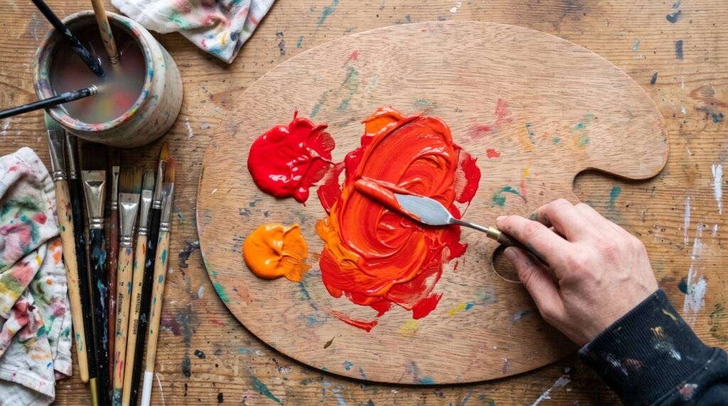
Red and orange are two of the most energetic colours on any palette, so it makes sense to wonder what happens when you put them together. Unlike some mixes that surprise you with mud, this one behaves beautifully. It is one of the first mixes I teach beginners because it builds confidence fast.
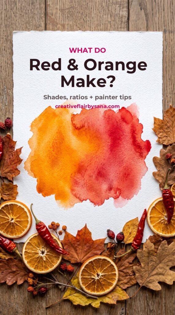
Quick answer: red and orange make red-orange, a warm, vivid shade often called vermilion or scarlet-orange. Add more orange and you get a fiery tangerine-red. Add more red and you get a deep scarlet. Add white and the mix turns into coral, salmon and peach. Add a touch of blue, green or brown and it becomes rust, terracotta and burnt orange.
Why red and orange make red-orange
Red and orange sit right next to each other on the colour wheel. Colours that are neighbours are called analogous colours, and when you mix them you simply get the colour in between them. That in-between shade is red-orange, one of the six tertiary colours on the traditional painter’s wheel.
Because there is no blue anywhere in this mix, nothing cancels the colours out. That is why red and orange stay bright and clean, while opposite colours (like purple and yellow) turn brown. If you want to understand that difference, read my guide to what purple and yellow make.
Try it on screen first with our free Paint Colour Mixer. Pick a red and an orange and slide the ratio to see every shade in between.
The shades you get at different ratios
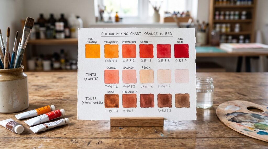
| Mix (red : orange) | Result | Lovely for |
|---|---|---|
| 1 : 3 | Bright tangerine with a red glow | Sunsets, marigolds, citrus |
| 1 : 1 | Classic red-orange (vermilion) | Flames, poppies, autumn leaves |
| 3 : 1 | Warm scarlet | Chillies, red flowers, bold accents |
| Any mix + white | Coral, salmon, peach | Skin tones, sunrise skies, soft florals |
| Any mix + a touch of blue or green | Rust, terracotta, burnt orange | Clay pots, brick, desert landscapes |
Most reds are stronger than most oranges, so start with orange and add red a little at a time. You will waste far less paint.
Which red you use matters
Not all reds are the same. Some lean towards orange (warm reds) and some lean towards purple (cool reds), and this changes your mix more than anything else.
- Warm red + orange (cadmium red, pyrrole red or “fire red” with cadmium orange): the brightest, cleanest red-orange. This is the one for flames and poppies.
- Cool red + orange (alizarin crimson or quinacridone red with orange): a slightly softer, rosier red-orange. Cool reds contain a hint of blue, so they calm the mix down a little. This is great for coral and dusky florals.
- Student-grade “primary red” + “orange”: usually a pleasant red-orange, though sometimes less intense and a little chalky.
If you are not sure whether your red is warm or cool, paint a small swatch next to an orange. If it looks like it belongs in the same family, it is warm. If it looks slightly pink or purple beside it, it is cool. Our Warm & Cool Colour Explorer explains this visually.
How to make rust, terracotta and burnt orange
Some of the most beautiful colours come from knocking red-orange back a little. Because blue and green are the opposites of orange and red, a tiny amount neutralises the brightness:
- Mix your red-orange first.
- Add the smallest touch of blue (ultramarine works well) or green. Use the tip of a palette knife, not a brush load.
- For rust, stop as soon as it dulls. For terracotta, add a little white and a touch of yellow ochre. For burnt orange, use more orange in the base and a hint of brown or blue.
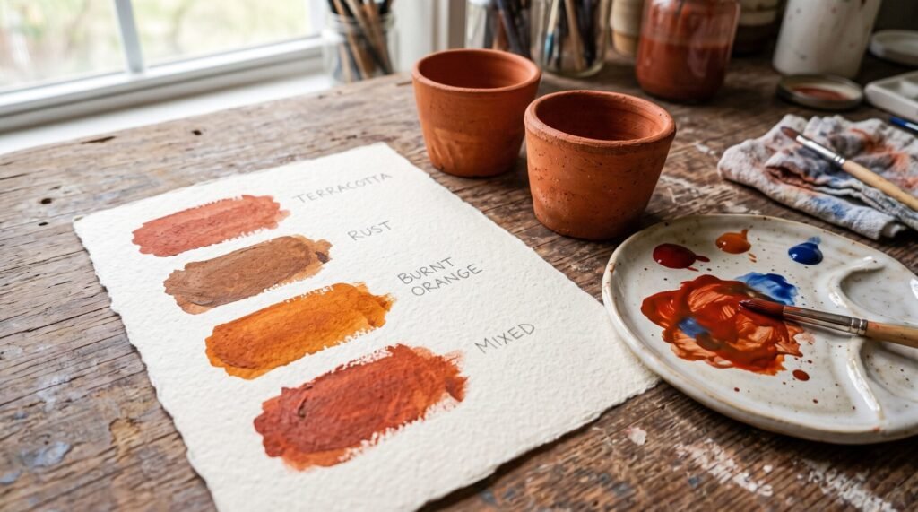
Terracotta and rust are also wonderful for Islamic geometric art and Moroccan-inspired patterns, where warm earthy tones sit beautifully beside teal and gold.
What about red and orange light?
On screens, colours mix with light instead of pigment. Red light and orange light both sit on the warm end of the spectrum, so mixing them still gives you a red-orange, just brighter and more luminous than paint. Unlike purple and yellow, there is no big surprise here.
Ways to use red-orange in your paintings
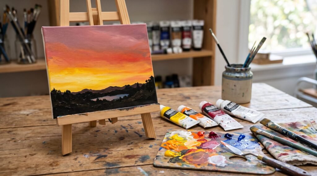
- Sunsets: blend from yellow to orange to red-orange to a dusky pink near the horizon.
- Fire and candlelight: keep the brightest yellow in the centre and let red-orange form the outer flames.
- Autumn trees: dab red-orange, orange and rust together for leaves that feel alive.
- Warm skin undertones: a little red-orange with white and a hint of brown is the base of many skin mixes.
- Accents: a small spot of red-orange draws the eye instantly, especially next to its opposite, blue-green.
A quick red and orange mixing exercise
- Paint a strip of orange on the left of a card and red on the right.
- Fill five squares in between, slowly moving from orange to red.
- Underneath, repeat each square with white added to see the corals and peaches.
- On a third row, add a speck of blue to each to discover your rusts and terracottas.
Use our Tints & Shades Generator to preview lighter and darker versions, or the Analogous Colour Generator to find colours that sit happily beside red-orange.
Looking for a relaxing first project? Our DIY Islamic Calligraphy Painting Kit includes warm and cool paints you can mix just like this.
Frequently asked questions
What color does red and orange make?
Red and orange make red-orange, a vivid warm colour also known as vermilion or scarlet-orange. More orange gives a tangerine shade, more red gives scarlet.
Is red-orange a primary, secondary or tertiary colour?
Red-orange is a tertiary colour. It is made by mixing a primary (red) with the secondary colour next to it (orange).
What do red and orange make when mixed with white?
White turns red-orange into coral, salmon and peach, depending on how much you add.
How do I make red-orange darker without black?
Add a tiny touch of blue, green or brown. Black can make red-orange look dirty, while a complementary colour gives a richer, more natural shadow.
What colours go with red-orange?
Its complementary colour is blue-green (teal), which makes red-orange look even brighter. Use our Complementary Colour Finder for exact matches. Gold, cream and deep navy also pair beautifully with it.
Have a question about mixing warm colours? Message me on WhatsApp. I would love to see what you are painting. – Sana