
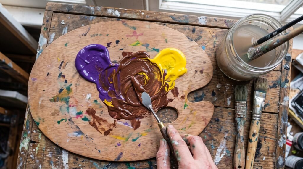
If you have ever mixed purple and yellow paint expecting something bright and been handed a puddle of brown, you are not alone. It catches almost every beginner out, and I still remember the first time it happened to me at art college. The good news? That “muddy” result is one of the most useful mixes on your palette once you understand what is going on.
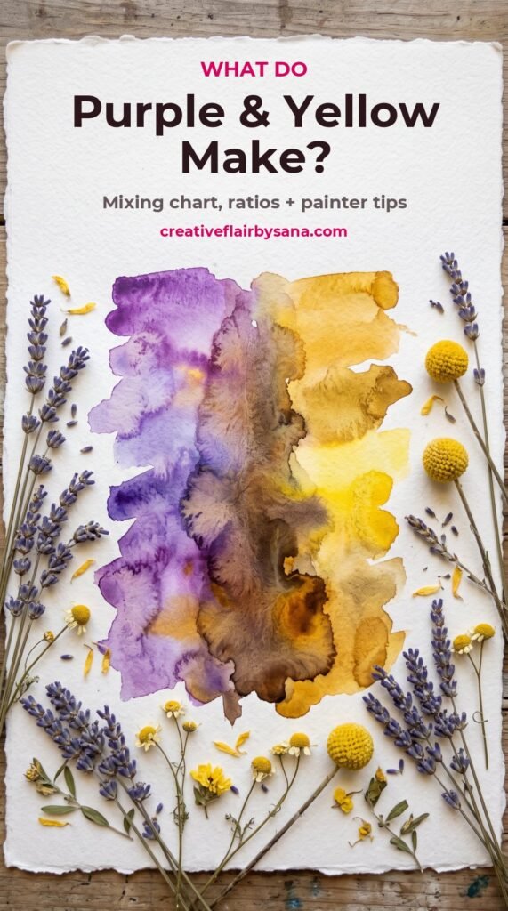
Quick answer: purple and yellow make brown. Because they sit opposite each other on the colour wheel, they cancel each other out and create a neutral. Use more yellow and you get olive, khaki or mustard-brown. Use more purple and you get a deep, cool brown that leans towards plum or charcoal. Add white and those browns turn into soft taupes and beiges.
Why purple and yellow make brown
Purple and yellow are complementary colours. On the traditional painter’s colour wheel (red, yellow and blue as primaries), every colour has an opposite: red and green, blue and orange, and purple and yellow.
Purple is made from red and blue. Yellow is the third primary. So when you mix purple with yellow, you are really mixing all three primaries together, and red, yellow and blue together always make a neutral: brown, grey or something close to black, depending on the exact paints and how much of each you use.
Want to see this for yourself before you open a tube? Try our free Paint Colour Mixer. Pick a purple and a yellow, move the slider and watch the mix shift from olive to brown to plum.
What colour you get at different ratios
The ratio matters far more than people expect. Here is what happens as you change the balance:
| Mix | Result | Great for |
|---|---|---|
| 1 part purple : 4 parts yellow | Dull mustard or olive yellow | Autumn leaves, old brass, shadows on yellow objects |
| 1 part purple : 2 parts yellow | Khaki or olive brown | Grass in shade, wood, earthy backgrounds |
| Equal parts | Mid brown, sometimes greyish | Tree trunks, soil, neutral backgrounds |
| 2 parts purple : 1 part yellow | Deep cool brown with a plum tint | Dark shadows, rich wood grain, night scenes |
| Any of the above + white | Taupe, mushroom, warm grey, beige | Skin undertones, stone, soft calligraphy backgrounds |
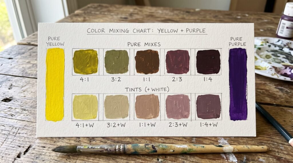
A tip I give everyone: always add the stronger colour to the weaker one, a tiny bit at a time. Most purples are much stronger than yellow, so start with your yellow and add purple with the tip of your brush. If you do it the other way round, you will use half the tube of yellow trying to rescue it.
Your paint brand changes the result
“Purple” and “yellow” are not single colours. Every pigment behaves differently, which is why your mix may look nothing like a friend’s. Here are a few common pairings in acrylic:
- Dioxazine purple + cadmium yellow (or a cad yellow hue): a strong, dark chocolate brown. Dioxazine is very powerful, so use only a speck.
- Quinacridone violet + lemon yellow: a warmer, reddish brown with a slightly pink glow.
- Ultramarine violet + yellow ochre: soft greyish browns and lovely muted neutrals, perfect for stone and old walls.
- Student-grade “purple” + “primary yellow”: usually a mid brown that can turn chalky. Fine for practice, but expect less depth.
What about purple and yellow light?
This is where it gets confusing, because screens work differently from paint. Paint mixes by subtracting light, so more colours means darker and duller results. Light (on a phone or TV) mixes by adding light. Yellow light and purple light together make a very pale, almost white colour with a pinkish tint. So if a website or app tells you purple and yellow make “white”, it is talking about light, not paint.
When should you mix purple and yellow on purpose?
Once you stop seeing brown as a mistake, this mix becomes a favourite. I use it for:
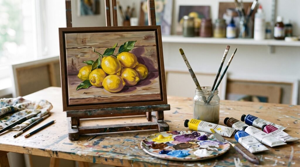
- Shadows on yellow objects. Adding black to yellow turns it green and lifeless. Adding a touch of purple instead gives a natural, believable shadow on lemons, sunflowers and gold.
- Calming down a colour that is too loud. If your yellow sky is screaming, a whisper of purple knocks it back without changing its character.
- Mixing natural browns. Browns mixed from complementaries look far richer than brown straight from the tube, because you can push them warmer or cooler.
- Backgrounds for calligraphy. In my Islamic calligraphy pieces I often want a warm, quiet background so the gold lettering can shine. Purple, yellow and a lot of white make beautiful parchment and sandstone tones.
How to keep the mix from turning muddy
“Muddy” usually means the mix happened by accident, or there is too much going on. A few habits fix it:
- Mix on the palette, not the canvas. Blend your brown fully, then put it down in one confident stroke.
- Use clean water and a clean brush. A little leftover blue or green in your brush will push the mix towards grey.
- Limit yourself to two pigments plus white. Three or four colours in one mix is where mud really starts.
- Check the value. Often a mix looks wrong not because of its colour but because it is too dark or too light. Our Colour Value (Grayscale) Checker shows you how light or dark a colour really is.
A 10-minute practice exercise
Grab a piece of card, your purple, your yellow and white.
- Paint a strip of pure yellow on the left and pure purple on the right.
- In between, paint five squares, moving slowly from mostly yellow to mostly purple.
- Below each square, paint the same mix again with white added.
- Label the ratios. You now have your own purple and yellow mixing chart to keep beside your easel.
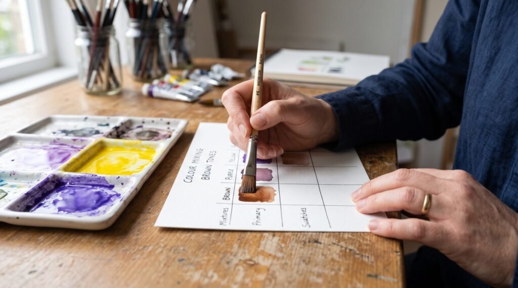
If you enjoy calm, guided painting like this, our DIY Islamic Calligraphy Painting Kit comes with six colours you can mix in exactly this way, including a gold-yellow and a rich pink.
Other complementary mixes to try
- Red and green make brown and deep greys.
- Blue and orange make browns, slate greys and beautiful shadows for skies.
For a mix that stays bright instead of turning brown, see what red and orange make.
Use our Complementary Colour Finder to find the opposite of any colour, or our What Colours Make ___? mixer to work backwards from the colour you want.
Frequently asked questions
What color do purple and yellow make?
In paint, purple and yellow make brown. The exact shade ranges from olive and khaki (more yellow) to a deep plum-brown (more purple). In light, they make a very pale, pinkish white.
Do purple and yellow make grey?
They can. With a cool, bluish purple and a lemon yellow, the brown often leans grey. Adding white makes it look even more like a warm grey.
Why are purple and yellow complementary colours?
On the painter’s colour wheel, purple (red + blue) sits directly opposite yellow. Opposite colours contain all three primaries between them, so they neutralise each other when mixed and make each other look brighter when placed side by side.
Do purple and yellow look good together?
Yes, side by side they are one of the most striking pairs. Because they are opposites, each makes the other look more vibrant. Think lavender fields at sunset or a purple wall with gold calligraphy.
How do I make the brown lighter?
Add white for a soft taupe, or add more yellow for a warmer, golden light brown.
Have a mixing question? Message me on WhatsApp. I love hearing what you are painting. – Sana