
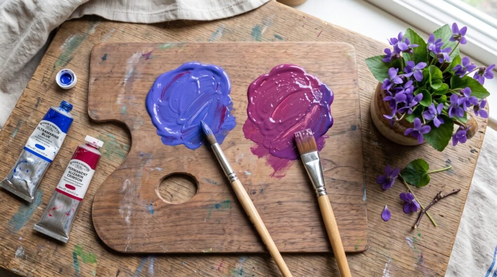
Ask ten people whether violet and purple are the same colour and you will get ten different answers. Some say they are identical, some say violet is lighter, and some insist purple is just the everyday word. The truth is more interesting, and once you understand it you will choose and mix these colours with much more confidence.
Quick answer: violet and purple are not quite the same. Violet is a true colour of the rainbow, with its own wavelength of light, and it leans towards blue. Purple is not in the rainbow at all. It is a mix of red and blue, and it sits more evenly between the two or leans towards red. In everyday painting the names are often swapped, but if you want cooler, bluer purples you are thinking of violet, and if you want warmer, redder ones you are thinking of purple.
The science: violet is in the rainbow, purple is not
When white light passes through a prism, it splits into the spectrum: red, orange, yellow, green, blue and finally violet at the very end. Violet light has the shortest wavelength we can see, roughly 380 to 450 nanometres.
Purple does not appear anywhere in that spectrum. Our eyes and brain create purple when red and blue light reach us together. Scientists call it a non-spectral colour, which is a fancy way of saying it only exists as a mixture. Magenta is another example.
So in the world of light, violet is a single colour and purple is a blend.
The painter’s view: how they look side by side
| Violet | Purple | |
|---|---|---|
| Leans towards | Blue (cooler) | Red, or an even balance (warmer) |
| In the rainbow? | Yes | No, it is a mixture |
| Mood | Calm, mysterious, spiritual | Rich, royal, romantic |
| Typical paints | Ultramarine violet, dioxazine violet | Quinacridone violet, cobalt violet, mixed crimson and blue |
| Natural examples | Violets, irises, twilight skies | Plums, grapes, aubergines |

Notice that many paint names do not follow the rule perfectly. A tube called “violet” can look quite reddish, and many artists simply use “purple” for the whole family. That is fine. What matters is whether the colour leans blue or red, because that changes how it mixes.
On the colour wheel
On the traditional painter’s wheel (red, yellow and blue as primaries), the secondary colour between red and blue is often labelled violet, especially in older colour theory books, and is called purple in many school charts. Either way, it is the opposite of yellow.
If you split that section of the wheel more finely, you get blue-violet on the cool side and red-violet on the warm side. Blue-violet is what most people picture as violet, and red-violet is closer to what most people call purple or plum.
How to mix violet and purple
Both come from red and blue. The difference is the balance and which red and blue you choose.
To mix a clear violet
- Start with a blue that leans slightly towards red, such as ultramarine.
- Add a small amount of a cool red, such as alizarin crimson or quinacridone rose.
- Keep blue as the larger part of the mix. A ratio of about 3 parts blue to 1 part red is a good starting point.
To mix a rich purple
- Use roughly equal parts of a cool red (crimson or magenta) and ultramarine blue.
- For a warmer, plum-like purple, add a little more red.
Why do my purples turn muddy? Usually because the red or blue already contains a bit of yellow. Warm reds like cadmium red lean orange, and blues like cerulean or phthalo can lean green. Yellow is purple’s opposite, so even a hidden touch of it dulls the mix. Choose a cool red and a warm, reddish blue for the cleanest results.
Try different combinations instantly with our free Paint Colour Mixer.
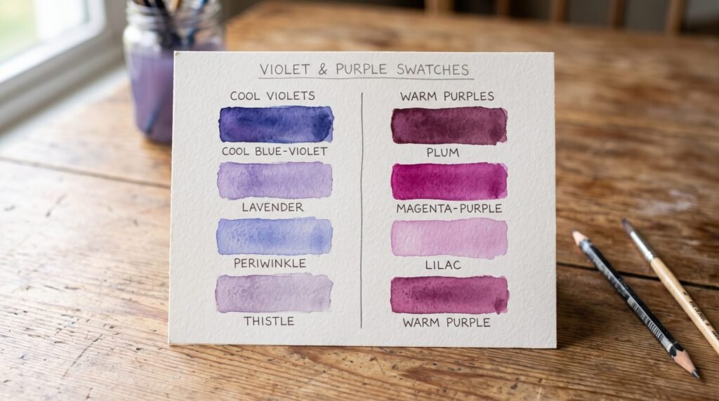
Lavender, lilac, mauve and plum
These are the tints and shades of the violet and purple family:
- Lavender: violet plus white, cool and soft.
- Lilac: a slightly pinker, lighter purple.
- Mauve: purple softened with grey or a touch of its opposite, yellow.
- Plum and aubergine: deep purples darkened with a little blue, brown or the complementary yellow.
See every lighter and darker version of a colour with our Tints & Shades Generator, or identify a mystery shade with the Colour Name Finder.
What about digital colours?
This catches designers out. In web colours, the official name “violet” (#EE82EE) is actually a light pinkish lavender, while “purple” (#800080) is a deep, dark red-purple. Neither matches the painter’s idea of violet very well, so if you are matching a design to paint, work from the actual colour code rather than the name. Our HEX to RGB converter helps you compare codes.
Using violet and purple in your art
- Shadows: blue-violet makes beautiful cool shadows on snow, white walls and skin in daylight.
- Skies: a band of soft violet near the horizon makes sunset and dusk skies glow. See how it sits with warm tones in my guide to what red and orange make.
- Contrast with gold: because purple is the complement of yellow, deep purple and gold make each other look richer. It is a combination I love for calligraphy backgrounds.
- Flowers: violets, irises, lavender and wisteria all need a range from cool violet to warm purple.

Want to know what happens when you mix purple with its opposite? Read what purple and yellow make. Or find the complement of any shade with our Complementary Colour Finder.
If you enjoy painting calm, meaningful pieces, our DIY Islamic Calligraphy Painting Kit is a lovely place to start, with paints you can mix into your own purples and pinks.
Shades of Purple and Violet: Names You Will Hear
Once you start looking, the purple family has dozens of names. Here are the purple shade names you will meet most often in paint ranges, interior design and fashion, sorted from cool (violet side) to warm (purple side):
- Periwinkle: a soft blue-violet, almost lavender-blue.
- Lavender: a pale, cool violet, like the flower.
- Wisteria: a gentle mid violet with a hint of grey.
- Amethyst: a clear, jewel-like violet-purple.
- Heliotrope: a bright pinkish purple.
- Orchid: a light purple leaning towards pink.
- Mauve: a greyed, dusty purple.
- Plum: a deep reddish purple.
- Aubergine (eggplant): a very dark purple, almost black.
- Byzantium: a dark, rich red-purple.
When you see these names on a paint chart or a fabric label, ask yourself the same question every time: does it lean blue or red? That tells you instantly whether it belongs on the violet side or the purple side of the family.
Violet and Purple Paints Worth Knowing
Paint labels often list a pigment code, and this is the most reliable way to know what you are buying. These are the violet and purple pigments I would suggest getting to know:
| Pigment | Code | Leans | What it is like |
|---|---|---|---|
| Dioxazine violet | PV23 | Blue-violet | Extremely strong. Looks almost black straight from the tube, but glows when thinned or mixed with white. |
| Ultramarine violet | PV15 | Blue-violet | Soft and gentle. Lovely granulating texture in watercolour. |
| Quinacridone violet | PV19 | Red-violet | Transparent and bright. Great for glazing and florals. |
| Cobalt violet | PV14 | Warm violet | Delicate and pricey, with a weak tinting strength. |
| Manganese violet | PV16 | Cool violet | Muted and slightly dusty. Good for shadows. |
Most of these are stocked by art supply stores across Australia and the US, often in both student and artist grades. If you are just starting out, one dioxazine violet plus white will give you a surprising range, from deep shadow colours to soft lavender.
Curious what happens when purple meets its opposite? See what green and purple make and why the mix turns into soft, useful greys.
Violet vs Purple: Frequently Asked Questions
Is violet lighter than purple?
Not necessarily. Both can be light or dark. The real difference is temperature: violet leans blue and purple leans red. People often think of violet as lighter because of flowers like violets and the web colour named violet.
Is violet a shade of purple?
In everyday language, yes, most people treat violet as one kind of purple. Scientifically, violet is a spectral colour and purple is a mixture, so they are technically different.
Why is violet in the rainbow but purple is not?
The rainbow only contains single wavelengths of light. Violet has its own wavelength. Purple needs red and blue light at the same time, so it can never appear in a rainbow.
Which is warmer, violet or purple?
Purple is usually warmer because it contains more red. Violet is cooler because it leans towards blue.
What is the opposite of violet and purple?
On the painter’s colour wheel, the opposite of violet and purple is yellow. Blue-violet pairs with yellow-orange, and red-violet pairs with yellow-green.
Final Thoughts: Choosing Between Violet and Purple
Violet and purple are close cousins rather than twins. Violet is the cooler, bluer colour that lives at the end of the rainbow. Purple is the warmer, redder mixture that our eyes create from red and blue. In day-to-day painting the names overlap, and that is perfectly fine, as long as you know which way your colour leans.
The best way to really understand the difference is to mix both yourself. Grab a blue and a cool red, make a cool violet and a warm purple side by side, then lighten each with white. You will see the difference immediately.
Ready to try? Experiment for free with our Paint Colour Mixer and the rest of our 50 free colour tools, or bring your new colour knowledge to a calm, meaningful project with our DIY Islamic Calligraphy Painting Kit.
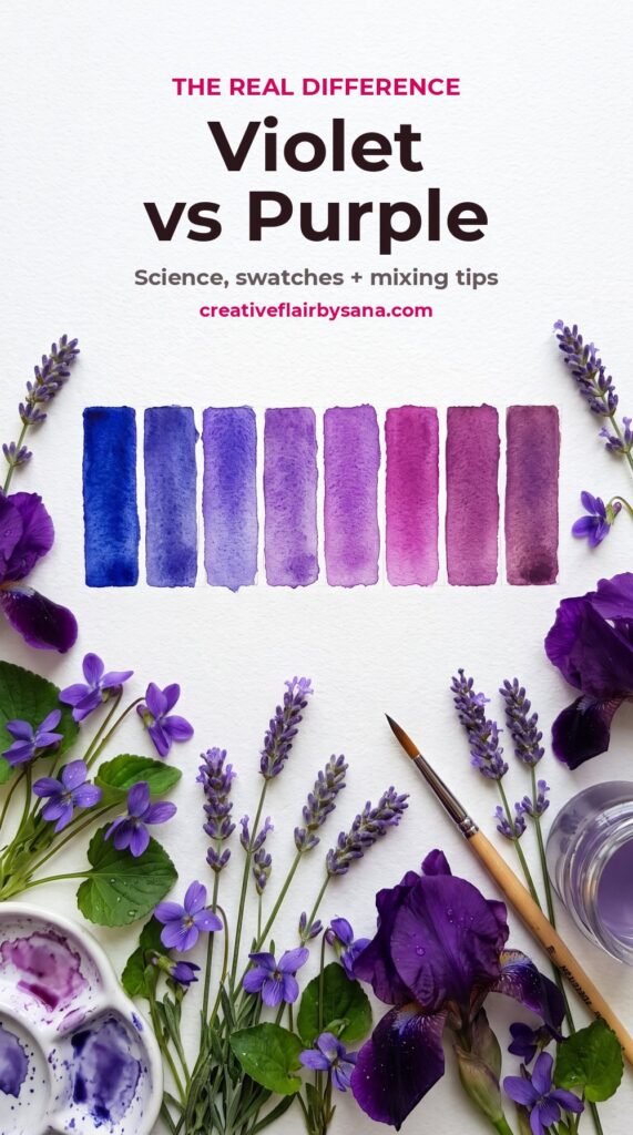
Still not sure whether your tube is violet or purple? Send me a photo on WhatsApp and I will tell you how I would use it. – Sana