
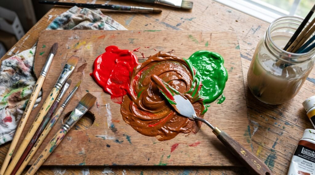
Red and green are one of the most famous colour pairs in the world. Think Christmas, strawberries, poppies in a field. But what happens when you actually mix them together on your palette? If you are expecting something festive, you might be surprised.
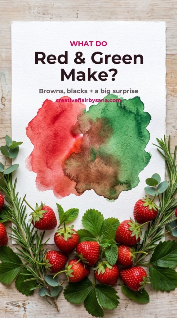
Quick answer: in paint, red and green make brown. Because they are opposite (complementary) colours, they cancel each other out into a neutral. More red gives a warm reddish brown or brick colour. More green gives olive, khaki or a deep forest-brown. With some combinations you can even mix a rich, almost-black. In light (on screens), red and green make yellow, which surprises almost everyone.
Why Red and Green Make Brown When Mixed
On the painter’s colour wheel, red and green sit directly opposite each other. Green is made from blue and yellow, so when you add red you are mixing all three primaries together. Red, yellow and blue always combine into a neutral: brown, grey or near-black, depending on the exact paints and amounts.
This is exactly the same thing that happens with the other two complementary pairs. Purple and yellow also make brown (read what purple and yellow make), and blue and orange make browns and slate greys.
Preview the mix before you squeeze any paint with our free Paint Colour Mixer.
Mixture of Red and Green: What You Get at Each Ratio
| Mix (red : green) | Result | Useful for |
|---|---|---|
| 4 : 1 | Dull, earthy red or brick | Brick walls, autumn leaves, rusty metal |
| 2 : 1 | Warm reddish brown | Wood, chestnut hair, tree bark |
| 1 : 1 | Mid brown or deep neutral | Soil, shadows, neutral backgrounds |
| 1 : 2 | Olive brown or khaki | Foliage in shadow, dry grass, army greens |
| 1 : 4 | Muted, dark green | Distant trees, pine forests, dark leaves |
| Any mix + white | Taupe, greige, mushroom | Stone, linen, soft backgrounds |
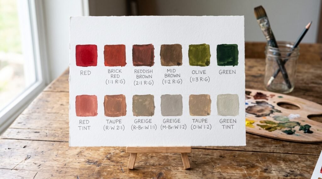
Green pigments, especially phthalo green, are extremely strong. Start with red and add green with the very tip of your brush or palette knife.
Red and Green Makes Different Browns: Warm vs Cool
Not every red and green mix gives the same brown. The temperature of each colour decides the result:
- Warm red + warm green (cadmium red with sap or olive green): a cosy, golden chocolate brown. Perfect for wood, bread crusts and autumn scenes.
- Cool red + cool green (alizarin crimson with phthalo or viridian green): a deep, cool brown that slides towards black. Ideal for night shadows and dark water.
- Warm red + cool green: a balanced, neutral brown that works almost anywhere.
If you need a lighter version, add white for soft greige or a touch of yellow ochre for a sun-warmed tan. Keeping notes of which combinations you like will save you hours later.
Making Black From Red and Green
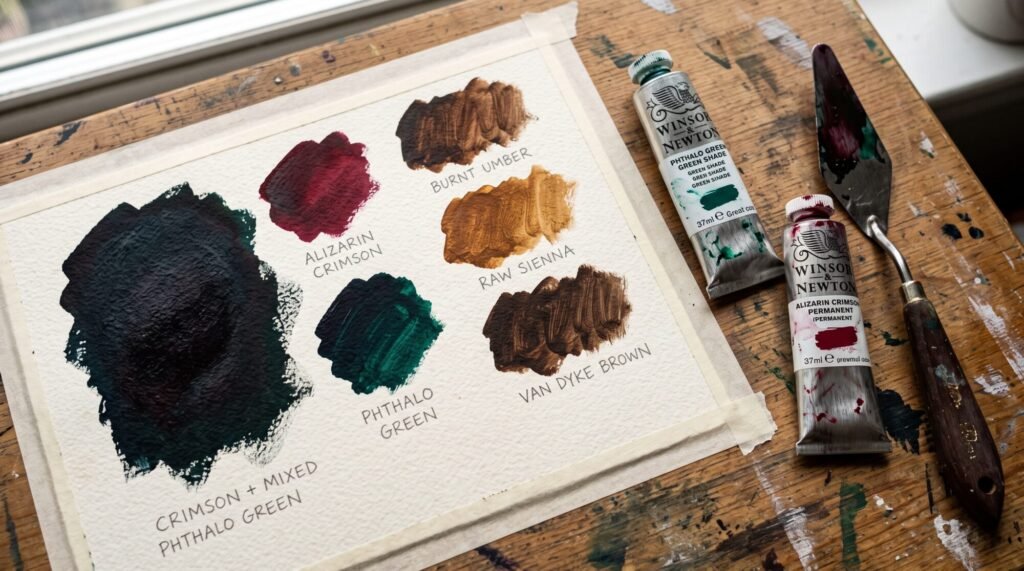
Here is a secret many painters love: a deep red and a deep green can make a beautiful chromatic black, a black that feels richer and more alive than black straight from a tube.
- Alizarin crimson (or quinacridone red) + phthalo green makes a very dark, almost-black mix. Push it slightly redder or greener to make warm or cool blacks.
- Cadmium or pyrrole red + sap green makes a warmer, browner dark, lovely for tree trunks.
Use these darks for shadows, deep water and night scenes. Check how dark your mix really is with our Colour Value (Grayscale) Checker.
Why red and green light make yellow
On a phone or computer screen, colour is made by adding light, not mixing pigment. Red light and green light together stimulate the parts of your eye that respond to both, and your brain sees yellow. Add blue light as well and you get white.
So both answers are correct. In paint, red and green make brown. In light, red and green make yellow.
How to use red and green together
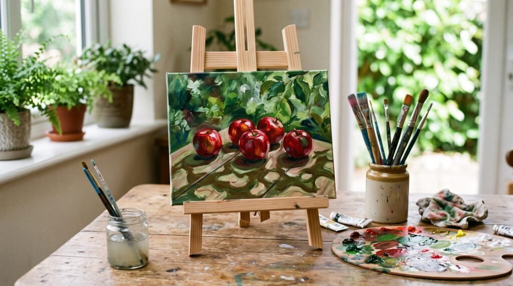
- Natural shadows: a touch of green in a red apple’s shadow, or a touch of red in a green leaf’s shadow, looks far more natural than adding black.
- Calming a loud colour: if your red is too bright, a whisper of green tones it down without changing its character.
- Making contrast pop: placed side by side, red and green make each other look more vibrant. A small red flower in a green field instantly draws the eye.
- Skin tones: a hint of green can calm overly pink or red skin mixes. See our Skin Tone Mixing Guide.
A quick red and green mixing exercise
- Paint a strip of red on the left of a card and green on the right.
- Mix five steps in between, moving from mostly red to mostly green.
- On a second row, add white to each to find your taupes and greiges.
- Try one square with your darkest red and green to discover your own chromatic black.
Want a mix that stays bright instead? Neighbouring colours do not cancel each other out. Compare this with what red and orange make. You can also find the exact complement of any colour with our Complementary Colour Finder.
Looking for a calm, guided project? Our DIY Islamic Calligraphy Painting Kit includes paints you can mix in exactly this way.
Mixing Red and Green in Acrylic, Watercolour and Oil
The colour theory is the same in every medium, but each one behaves a little differently:
Acrylic
Acrylic dries quickly and usually a shade darker than it looks when wet. Mix a little more than you think you need, and test a swatch before committing. A few drops of slow-drying medium gives you more time to adjust your red and green mixture on the palette.
Watercolour
In watercolour you can mix red and green on the palette, or let them meet on wet paper for soft, granulating browns and greys. You can also glaze: paint a thin layer of green, let it dry completely, then wash red over the top. The two layers combine optically into a glowing neutral that feels lighter than a palette mix.
Oil
Oils stay wet for days, so red and green blend smoothly and are easy to correct. Because oil colours are rich and slow, they are perfect for building deep chromatic blacks and subtle warm and cool browns.
Common Mistakes When Mixing Red and Green
- Adding green too fast. Phthalo green in particular can take over a whole puddle of red in seconds. Always add the stronger colour in tiny amounts.
- Using too many colours. Red, green and white is plenty. Adding a fourth colour is the quickest route to mud.
- Forgetting about value. Red and green are often similar in lightness, so a painting that only uses the two can look flat. Add lighter and darker versions for depth.
- Reaching for black. Black dulls red into a dirty maroon. A touch of green gives a cleaner, more natural shadow.
- Mixing on the canvas. Half-mixed red and green streaks look muddy. Mix fully on the palette first.
Red and Green in Real Life and Design
Once you start noticing red and green, you will see them everywhere. In Australia, the bright red of waratahs and bottlebrush flowers against grey-green eucalyptus leaves is a perfect natural example of complementary contrast. In the US and Australia alike, red and green are the classic Christmas colours, even though Christmas falls in summer down under.
A note for designers and teachers: red-green colour blindness is the most common form of colour vision deficiency, affecting roughly 1 in 12 men. If you are creating artwork, signs or worksheets that rely on red and green to communicate, check them with our Colour Blindness Simulator and add labels or patterns as well as colour.
Red and green is not the only complementary pair worth knowing. Read what green and purple make to see how they create olive, slate and plum greys.
Red and Green Mixing: Frequently Asked Questions
What colour does red and green make?
In paint, red and green make brown. More red gives a reddish brown, more green gives olive or khaki, and strong dark versions can make a near-black. In light, red and green make yellow.
Do red and green make black?
Deep, dark versions can, especially alizarin crimson with phthalo green. Most everyday reds and greens make brown rather than true black.
Why are red and green complementary colours?
They sit opposite each other on the painter’s colour wheel. Green contains blue and yellow, and red is the remaining primary, so together they contain all three primaries.
Do red and green look good together?
Side by side they create strong, energetic contrast. For a softer look, use a muted green like sage with a dusty red like terracotta.
How do I make the brown lighter?
Add white for taupe and greige, or add a little yellow for a warmer, golden brown.
Final Thoughts: Red and Green Make More Than Brown
Red and green may look festive side by side, but on the palette they work together as a powerful neutralising pair. In paint they make browns, olives, brick reds and even rich blacks. In light they surprise everyone by making yellow. Once you know how the ratios work, this “muddy” mix becomes one of the most useful tools you have for natural shadows and believable colour.
The best way to learn it is to try it. Make a quick red and green mixing chart this week and keep it next to your easel.
Ready to start? Test mixes for free with our Paint Colour Mixer and our other free colour tools, or relax with a guided project like our DIY Islamic Calligraphy Painting Kit.
Got a mixing question? Message me on WhatsApp. I love seeing what you are painting. – Sana